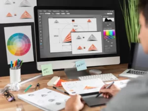
Looking for blog graphic design inspiration can empower bloggers and affiliate marketers to enhance their graphic design skills. Several platforms serve as excellent resources, each with its own unique offerings.
Dribbble and Behance are two popular platforms that cater to designers. Dribbble operates on an invite-only system, which helps maintain high-quality content by limiting membership to skilled individuals (Go Fish Digital). This results in a curated collection of designs, making it a great place to find polished artwork. However, this exclusivity can also limit the variety of available designs.
In contrast, Behance allows anyone to join and post artwork, leading to a larger archive of designs. This broader collection makes it easier to find specific design inspiration across various styles and trends.
| Feature | Dribbble | Behance |
|---|---|---|
| Membership | Invite-only | Open to all |
| Design Quality | High-quality, curated | Broad and varied |
| Community | Smaller, more niche | Larger, more diverse |
Awwwards is a unique platform that focuses on web design and development. It hosts competitions for web designers and developers, showcasing exemplary work from various categories. Users can utilize a powerful search tool to filter for specific inspiration, making it easier to discover great design ideas. This makes Awwwards an ideal resource for those looking to elevate their website aesthetics.

Pinterest is another excellent tool for design inspiration, uniquely serving as a platform for creating mood boards. Users can collect images and links related to their projects in a visually appealing format. This allows bloggers and marketers to visualize their ideas clearly and is especially useful for gathering inspiration for blog post graphic design and affiliate marketing visual content. With its easy-to-use interface, Pinterest enhances the creative process, making it simpler to organize thoughts and design elements.
By utilizing these platforms, individuals aiming to improve their affiliate marketing banners design can find a wealth of inspiration and resources to help them create visually compelling content.
Typography plays a vital role in graphic design, especially for bloggers and affiliate marketers seeking to convey their messages effectively. The choice of typefaces, the visual hierarchy they create, the use of white space, and their overall impact on users’ perception are critical components of successful design.
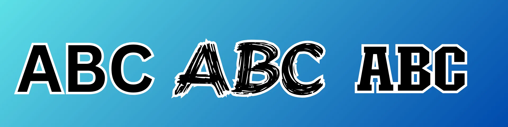
The choice of typeface sets the tone of the design and can convey a mood or personality, impacting the overall impression of the brand. Common typefaces include Arial, Times New Roman, Helvetica, and Garamond (Forge and Smith). Selecting the right typeface can enhance branding and create an emotional connection with the audience. Different typefaces communicate different messages, making it essential for bloggers to choose wisely based on their content and target audience.
Effective typographic hierarchy uses varying fonts, sizes, and colors to establish a visual order, directing the reader’s attention to the most important information first. consistency in typography involves using the same typefaces, fonts, and alignment throughout the design to create a cohesive look and feel. This strategic placement helps guide users as they navigate the content, making it easier for them to find and absorb the information they seek.
| Hierarchy Element | Recommended Size (px) | Purpose |
|---|---|---|
| Headings | 24-32 | Grab attention and establish main ideas |
| Subheadings | 18-22 | Break content into manageable sections |
| Body Text | 14-16 | Ensure readability and ease of understanding |
| Captions/Footnotes | 10-12 | Offer supplementary information |

White space, or negative space, is a critical component in typography design that contributes to balance, legibility, and focus within a page. Proper use of white space makes the page easy to navigate and understand. It allows the text and graphics to breathe, preventing a cluttered appearance that can overwhelm readers. Thoughtful alignment and spacing enhance visual coherence and balance, making the content more appealing.
Typography affects how users perceive and interact with digital content, influencing readability, accessibility, brand personality, and emotional resonance. When designed well, typography enhances user engagement by making text visually appealing and easy to read. This encouragement prompts users to spend more time on a website, leading to higher conversion rates. Clear, legible text makes calls to action stand out, guiding users toward desired actions, and contributing to success in blog post graphic design and affiliate marketing visual content.
Effective visual hierarchy is essential in graphic design, particularly for bloggers and affiliate marketers. It helps in organizing content to ensure that viewers can easily navigate and understand the message. Here are some key strategies for creating a strong visual hierarchy.
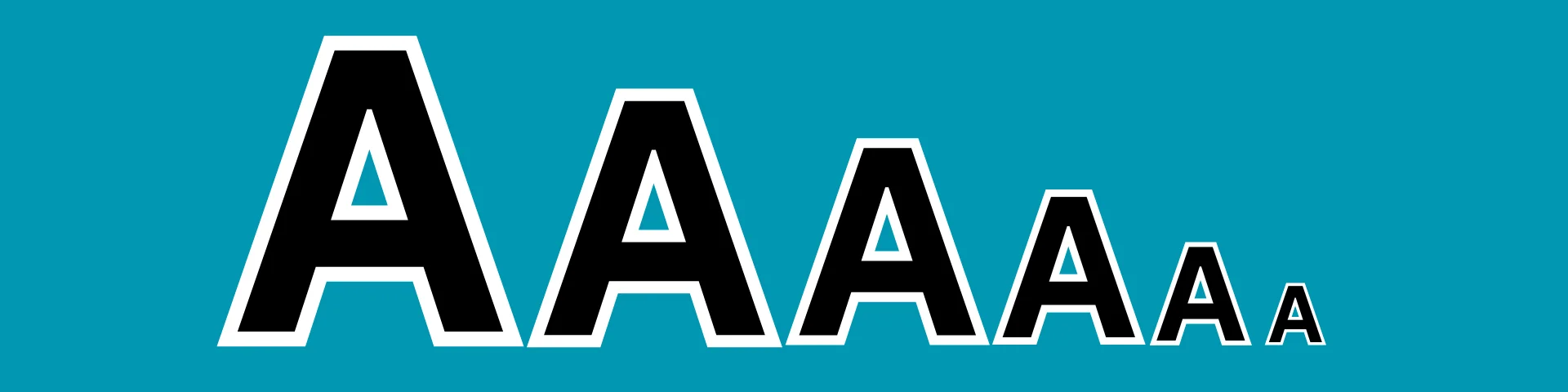
Size and scale are fundamental elements of visual hierarchy. Larger elements naturally draw more attention, indicating their importance within the design. For instance, headlines or calls-to-action should be the largest components, compelling viewers to engage first with these elements.
| Element Type | Recommended Size |
|---|---|
| Headline | Largest |
| Subhead | Medium |
| Body Text | Smaller |
| Call-to-Action Button | Prominent |

Color and contrast play a significant role in guiding the viewer’s attention. Effective use of vibrant colors paired with muted tones helps in emphasizing key components. Accessible color combinations adhering to visibility guidelines enhance designs for individuals with color blindness. For example, brands like Airbnb and Spotify utilize high-contrast pairings to maintain both aesthetic appeal and accessibility.
| Color Combination | Visibility Level |
|---|---|
| High Contrast | Excellent |
| Low Contrast | Poor |
| Accessible Palettes | Good for all viewers |

Leading lines are powerful tools that improve the flow of designs. They guide the viewer’s eyes where intended, creating a clear path for content consumption. By incorporating linear elements strategically, designers can enhance visual hierarchy and lead viewers with purpose, preventing distractions from the primary message.
| Leading Line Type | Usage Example |
|---|---|
| Diagonal Lines | Directing attention towards CTA |
| Horizontal Lines | Separating sections of content |
| Vertical Lines | Creating natural flow in layouts |
Proper spacing, including white space, is crucial for maintaining a clear visual hierarchy. It puts focus on important content, preventing clutter and ensuring impactful design layouts (Moonlight Creative). Adequate spacing between elements helps create an organized look, improving readability and user experience.

| Spacing Type | Application |
|---|---|
| Margins | Around entire design |
| Padding | Inside elements for separation |
| Line Height | Between lines of text |
Prioritizing these visual hierarchy strategies can greatly enhance blog graphic design, appealing to the target audience and improving engagement in blogging and affiliate marketing efforts. For additional inspiration, explore the benefits of effective blog post graphic design and how it enhances affiliate marketing visual content.
Staying updated with the latest trends in graphic design is essential for bloggers and affiliate marketers looking to enhance their visuals. Understanding these trends can help them create compelling content that attracts and retains audiences. Here are some of the most notable trends shaping design in 2024.
The retro pixels trend pays homage to early computer graphics and video games, featuring pixelated designs that evoke nostalgia. These graphics connect with audiences familiar with the aesthetics of the past, providing a fun and playful visual language. This style is particularly effective in attracting attention and creating memorable visual experiences.

Inclusivity is becoming a cornerstone of graphic design, reflecting a broader range of identities in visuals. Designers are focusing on representing diverse races, ethnicities, genders, abilities, and body types in their work. Brands like Google and Scope have made strides in diversity, incorporating inclusive emoji libraries and icons. This emphasis on representation makes visual content more relatable to a wider audience.
The design landscape in 2024 showcases various approaches that enhance user engagement and accessibility. A notable trend is the use of high contrast and bold typography, ensuring clarity and legibility for all users, including those with low vision. For example, Apple’s marketing for the Series 8 Watch features vibrant colors against stark black backgrounds that emphasize bold, sans-serif fonts.
| Trend | Description |
|---|---|
| Retro Pixels | Nostalgic designs with pixelated elements that connect with early digital culture. |
| Inclusivity | Visuals that represent diverse identities across racial, gender, and ability spectrums. |
| High Contrast Typography | Bold fonts with vibrant colors improving legibility for all users. |
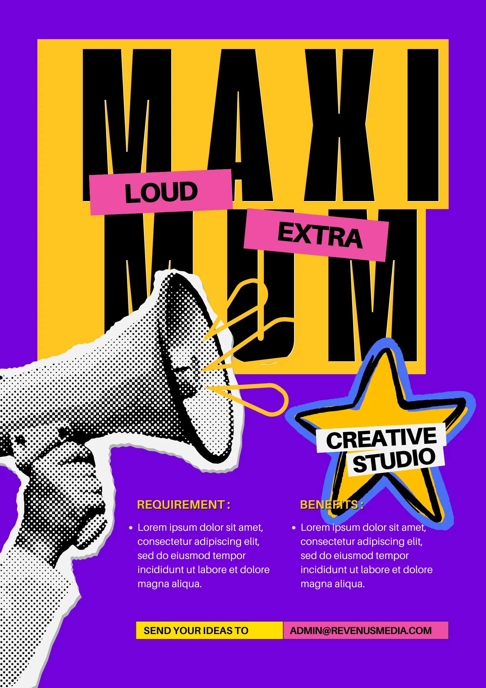
Maximalism is making a strong comeback in graphic design, characterized by dense compositions filled with bold fonts, colors, shapes, and visuals. This trend challenges traditional design minimalism, allowing for more expressive and vibrant designs. Alongside this, experimental typography is gaining traction, with designers pushing the boundaries of legibility. Modern, visually striking fonts serve as focal points, often utilizing abstract lettering to captivate audiences (Looka).
| Trend | Key Features |
|---|---|
| Maximalism | Use of bold elements, vibrant colors, and complex compositions. |
| Experimental Typography | Exploring unique, abstract fonts that challenge traditional legibility. |
Typography affects readability, brand perception, and user engagement. Choosing the right typeface, maintaining a strong visual hierarchy with font sizes and colors, and utilizing white space effectively can make content more appealing and easier to navigate.
Key elements include size & scale (larger text for headlines), color & contrast (high contrast for visibility), leading lines (guiding the viewer’s eye), and proper spacing (ensuring readability). These principles help organize content and make designs visually compelling.